


A West Philly based activist and programmer has built an app that allows people to visualize changes in income and racial diversity in their neighborhoods.
Aaron Kreider’s JusticeMap.org, an open online map layering race and income data across the United States, allows residents to analyze and visualize neighborhood’s socioeconomic shifts. Using data pulled by the U.S. Census Bureau, the comprehensive high resolution map — created with the support of the Sunlight Foundation — features the breakdown of race by block, county, census, and block group, while household income data are available by county or census tract. So, for example, JusticeMap.org allows you to easily find out the majority of residents in the 19143 zip code have a household income of $40,000 or less.
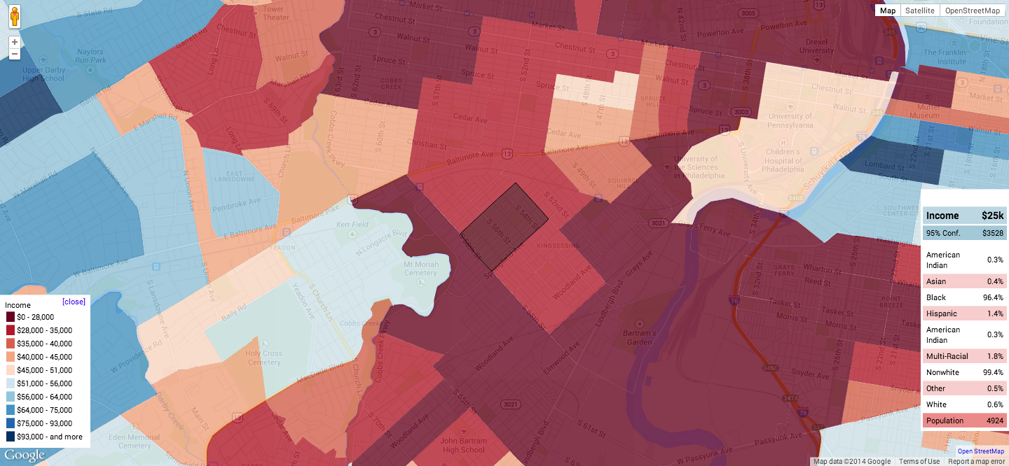
A map showing income levels for the 19143 zip code. Source: JusticeMap.org
“For several years I have wanted to make maps of the race and income data from the U.S. Census to help people visualize the large differences in race and income between counties, cities, neighborhoods and even blocks,” Kreider, who runs CampusActivism.org, wrote in a blog post for Sunlight Foundation in late January. “My goal is to help people, who do not have any map making or geographical information systems experience, to create maps that combine these open map layers with their own data.”
JusticeMap.org also includes some intriguing features that make visualizing and saving data with the open online map both easy and innovative. Users can save the map as an image, make their own map and host on their own site, add shapes to the map, use tile layers on an existing map, conduct statistical comparisons and different geographical intersections, and download the data. We’ve included a map of income levels in Philadelphia for readers to test below, but we suggest you head to the site and go through the data hands-on.
-Annamarya Scaccia


Recent Comments